Client
Friday Systems
Timeline
4 Months
Services
Product design
B2B STRATEGY
wireframing
ux/ui design
FIGMA
interaction design
my role
Lead Product Designer
Challenge
Solution
Result
Warehouse logistics are burdened by labor-intensive processes and inefficient automation, leading to higher costs and physical strain on workers. Traditional robots lack adaptability in product handling, making warehouse optimization difficult. There’s a need for an intuitive human-robot interface to streamline operations, reduce human error, and improve overall safety and efficiency.
Goals
User goals
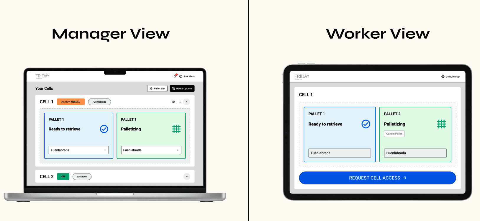
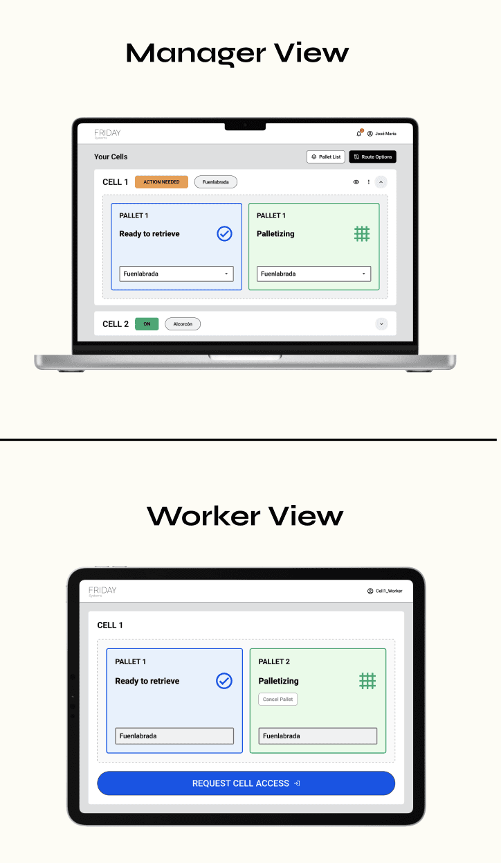
Allow warehouse operators to monitor and control the palletization process efficiently.
Enable managers to set business constraints and monitor operational metrics.
Facilitate seamless interaction between warehouse staff and the AI system, ensuring smooth operation and quick issue resolution.
Business goals
Demonstrate the value and ROI of the AI-driven palletization robot to potential clients.
Expand market reach by showcasing successful pilot projects and securing high-profile client meetings.
Enhance the product offering by continuously gathering user feedback and improving the interface based on real-world usage.
EMPATHIZING AND GATHERING UX Research
Physical Strain
Lack of Real-Time Data
Complex Interactions
DEFINING THE USER AND THE PROBLEM
In this phase, we prioritized and decided on the key issues to focus on based on our research findings and analysis.
What problem are we trying to solve? As the design team, we want to create a first release of the interface that allows users to interact with the AI-driven palletization robot in a safe and intuitive way. This involves ensuring that the interface is user-friendly, minimizes the risk of errors, and enhances overall user experience.
WHO IS THE TARGET?
Warehouse Workers
Warehouse Managers
IDEATION
To generate ideas that could effectively address the problems faced by our target users, we brought together a diverse group of stakeholders, including the CEO, CTO, COO, and the development team.
Divergent Thinking: We employed divergent thinking techniques to explore a wide range of possible solutions, encouraging team members to think outside the box and propose innovative ideas.
Benchmarking: We conducted benchmarking to understand existing solutions in the field. This helped us refine and adapt these ideas to fit our specific needs and the unique challenges of our project.
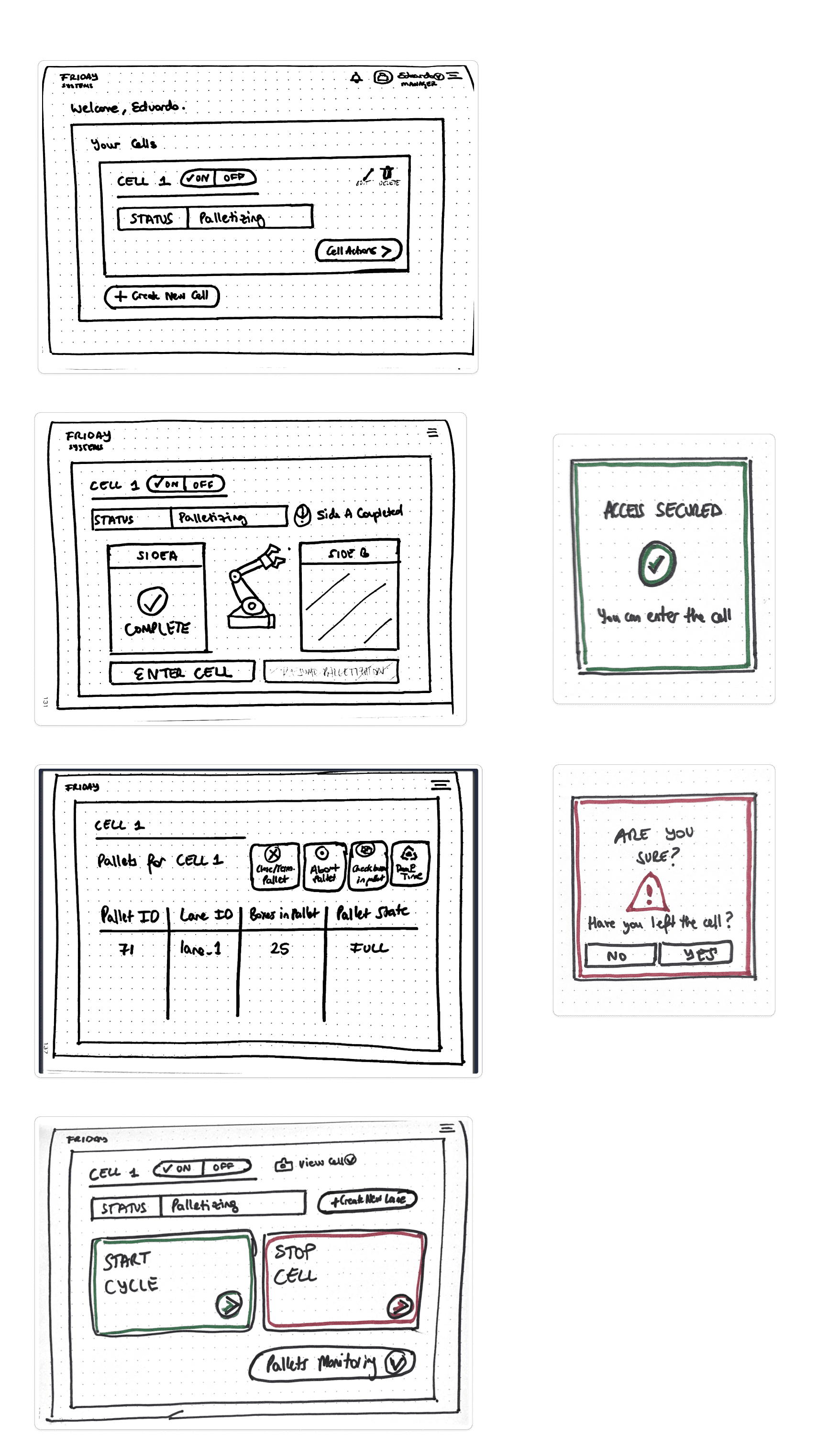
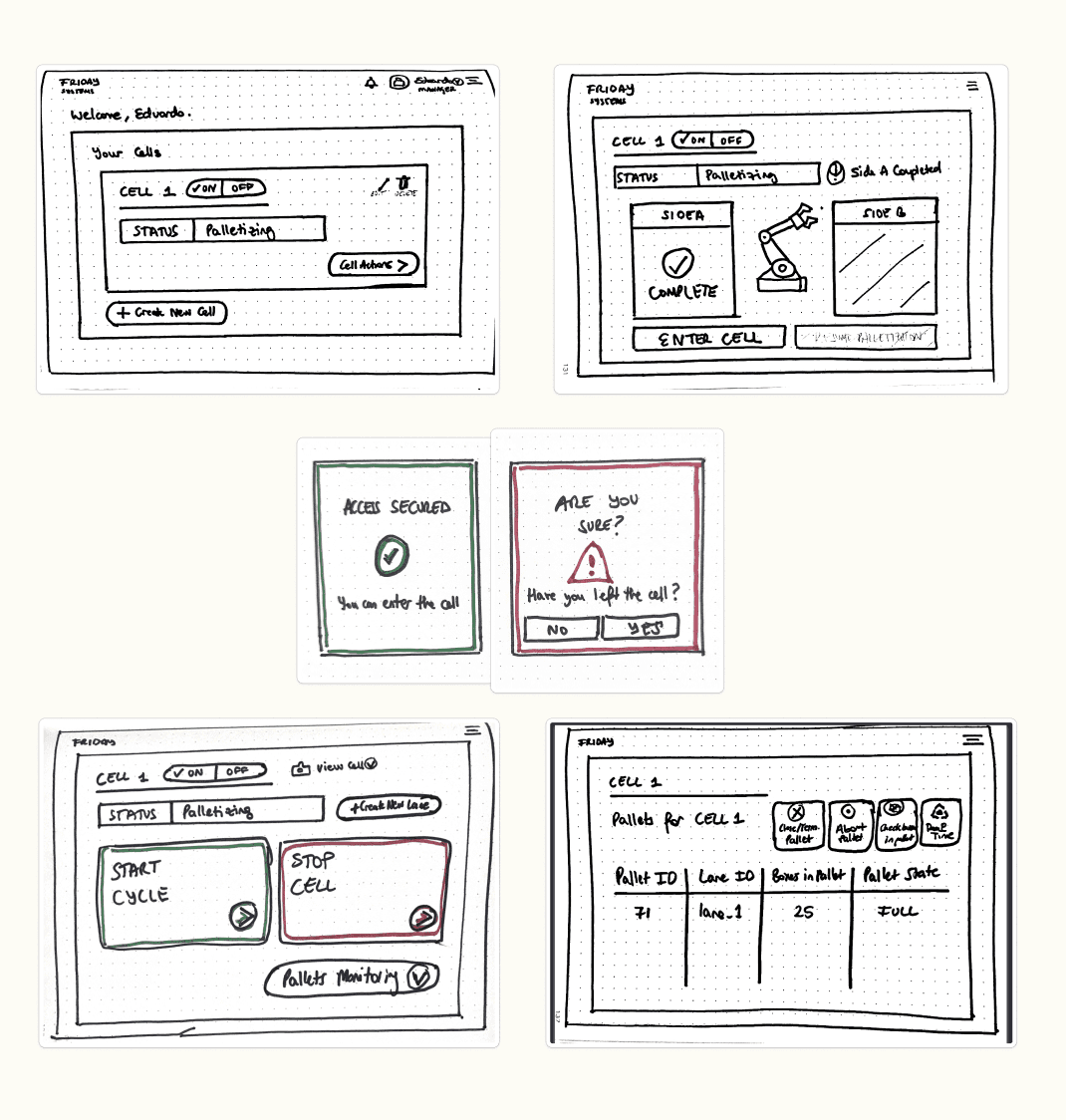
Sketching Workshop: We organized a sketching workshop where team members could quickly create, modify, and share initial sketches of the product. This was a powerful tool for visualizing our ideas and ensuring that everyone was on the same page about the direction we were heading.
PROTOTYPING
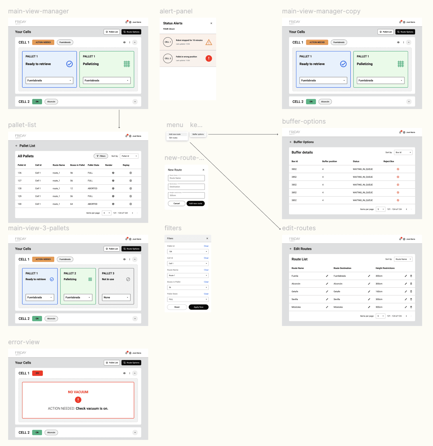
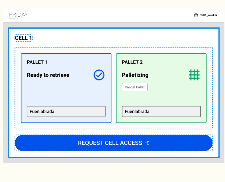
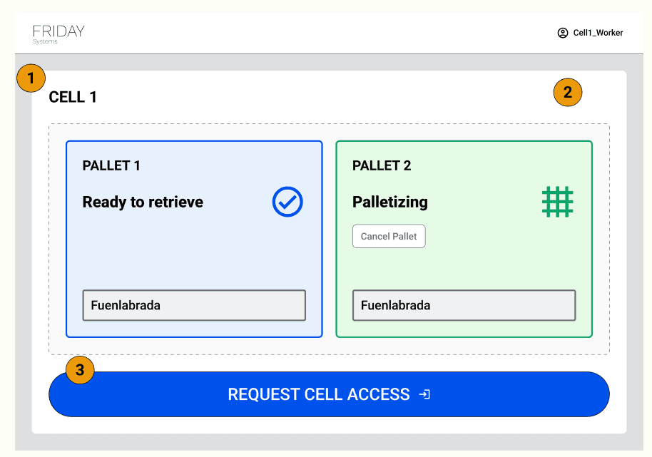
In the prototyping stage, we focused on creating a robust and user-friendly interface by establishing a clear path for common workflows and iterating on complex or bespoke requirements.
Establishing the happy path and ensuring that the most common and critical tasks could be completed smoothly and intuitively.
Iterating on edge cases. Based on our research, we identified complex or unique use cases and iterated on these scenarios to ensure they were well-supported. We focused on the key features required for the MVP and established others which would be implemented later in the roadmap.
We developed a comprehensive design system using Google's Material Design guidelines. This provided a consistent and cohesive visual language, ensuring that all elements of the interface were intuitive and aesthetically pleasing.
Design hand-off session. To facilitate a seamless transition from design to development, we conducted a detailed design hand-off session. This included color codes, font sizes and typography, grids and layouts as well as component sizing and values.
TEST AND ITERATION
In the testing stage, we focused on validating our hypotheses and ensuring the interface met user needs effectively.
Client Validation: We presented the MVP to prospective clients to gather initial feedback and validate our assumptions. This helped us ensure that our solution addressed real-world needs and pain points.
Pre-Development Testing with Figma: Before the engineering team began development, we conducted a thorough pre-development test using Figma. This allowed us to:
Test our hypotheses at a low cost by simulating the user experience with interactive prototypes.
Identify and resolve potential issues early in the process, minimizing the risk of costly changes during development.
Design Principles
Results
21% increase in operational efficiency of warehouse processes through a user-friendly and intuitive interface.
Successfully landed meetings with two high-profile clients interested in the AI palletization solution.
Secured a pilot project contract to implement and test the interface in a real-world warehouse setting.
Increased positive user feedback by 180% after conducting pre-development user tests.
Conclusion
User-centric design leads to increased efficiency and user satisfaction.
Collaborative ideation and prototyping drive innovation and practicality: Involving key stakeholders and the development team ensured a balance between creativity and practicality.
Iterative testing and feedback integration ensure success: Pre-development testing with Figma allowed us to validate hypotheses at a low cost and address issues early.
